The Photopia Blog
Tips, tutorials & inspiration for making slideshows
MARCH 14, By Photopia
Caption Alignment Options
Photopia gives users four choices for horizontal caption alignment and three for vertical alignment. Although these options seem straightforward, they may behave differently than you expect.
In today’s blog, you’ll learn about each alignment choice and why it behaves the way it does.
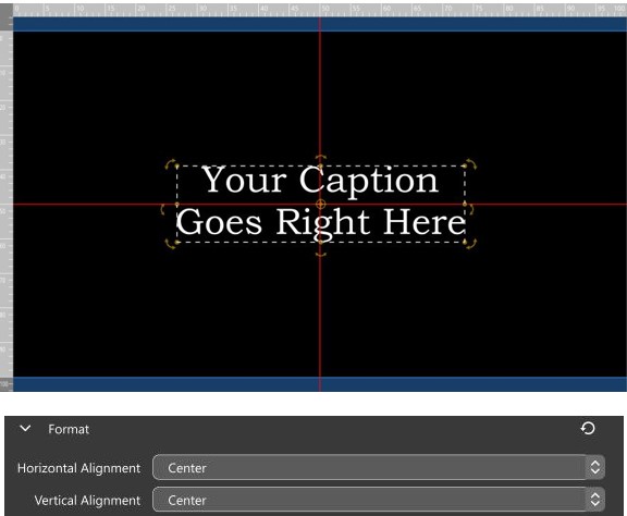
To understand alignment options, we toggled on a 2×2 red grid to show a vertical and horizontal crosshair.
The most common alignment setting is Center for both horizontal and vertical alignments. When the caption layers’ position is set to center, the grid lines pass through the center of the caption, both vertically and horizontally.
As new words are added to a single line, the letters will extend out in both directions, keeping the middle of the text centered horizontally. If new lines are added, the existing lines will shift up and down, ensuring that the middle of the text remains centered vertically.
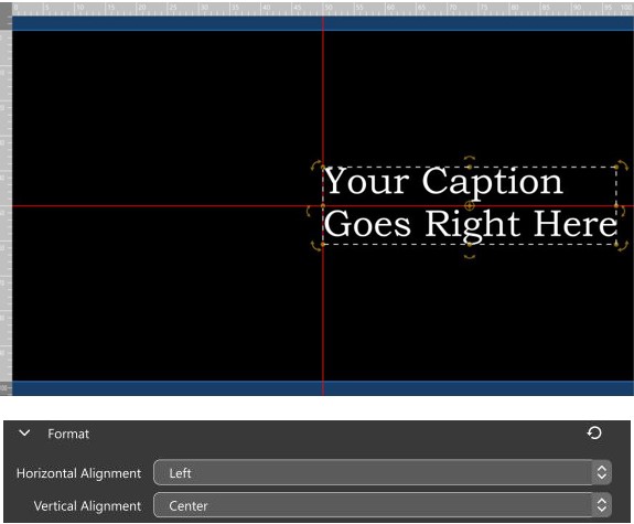
When the Horizontal Alignment is set to Left, the caption moves towards the right side of the screen. This happens because the Left Alignment option aligns the left edge of the caption’s horizontal position. In our case, the Horizontal Position is set at 0, which is the center of the screen.
Any new text added extends to the right, anchored from the left edge of the caption text box.
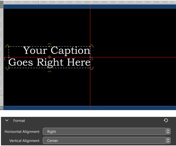
When the Horizontal Alignment is set to Right, the caption moves towards the left side of the screen. Choosing the Right Alignment option aligns the right edge of the caption’s horizontal position. In our case, the Horizontal Position is set at 0, which is the center of the screen.
Any new text added extends to the left, anchored from the right edge of the caption text box.
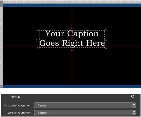
Vertical alignment doesn’t respond to the caption text box but to the font baseline and cap height. This distinction is important.
With the Vertical Alignment set to Bottom, the caption moves upward. However, the bottom edge of the text box does not align with the crosshair. All fonts are designed with a baseline and cap height. Some letters may dip below the baseline or extend above the cap height. For example, the lowercase letter “g” dips below the baseline. It is this baseline that the Bottom Vertical Alignment lines up with.
Any additional lines added will adjust the text upward, keeping the baseline of the bottom line aligned with the vertical position of the layer, which in our case is 0 or the center of the screen.
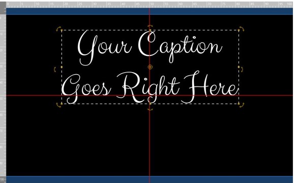
The font baseline is more apparent when using script fonts, as these fonts tend to have more tails extending from the letters
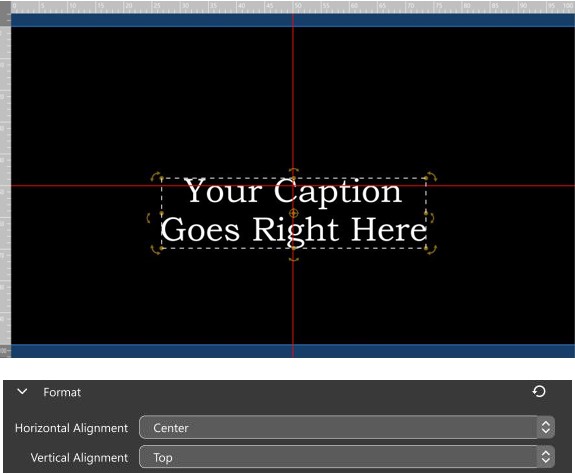
With the Vertical Alignment set to Top, the caption moves down. However, the top edge of the text box does not align with the crosshair. Similar to the font baseline, fonts also have what’s called a cap height. Some letters may extend above the cap height. The Captials “Y” and “C”, as well ask the top of the lower case “t” and the dot over the “i” are all above the Capt Height. It is this cap height that the Top[Vertical Alignment lines up with.
Any additional lines added will adjust the text downward, keeping the cap height of the top line aligned with the vertical position of the layer, which in our case is 0 or the center of the screen.
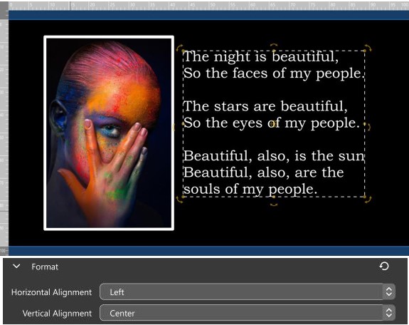
Our examples were designed to demonstrate the use of the center of the screen for clarity purposes. It’s important to note that alignment settings are anchored to the Caption position, not the center of the screen.
In the above example, the caption is set to have a Left Horizontal Alignment. It was then positioned next to an image, and as each line was added, the left edge remained aligned to the position with respect to the image.
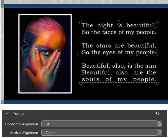
The last alignment option available is the Horizontal Fill option. Choosing this option will align the letters to the outer edges of the text box, resulting in parallel alignment on both the left and right sides. Please note that this may result in additional spaces between words.
