The Photopia Blog
Tips, tutorials & inspiration for making slideshows
OCTOBER 15, By Photopia
Using Grids in Photopia
Photopia offers a customizable grid system to help you create an image layout within your slides. The grid can be defined and colored based on your individual needs. Read more to learn how to use Grids.
Grids provide a visual guide in the Preview window for laying out images and captions in slides. To see a basic Grid, it must be toggled on.
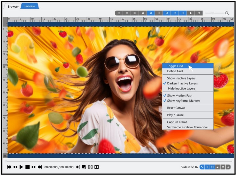
There are two options for toggling the grid view. Right-click in the preview window to see the Toggle Grid option at the top of the fly-out menu.
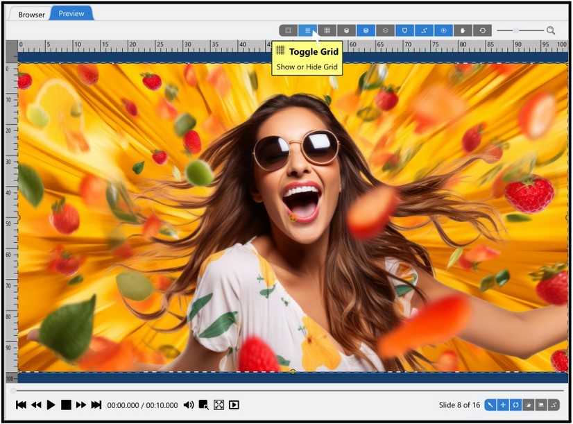
There is also a Toggle Grid icon at the top of the preview window.
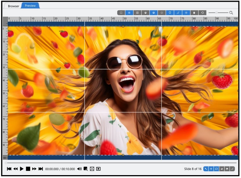
Once you see the grid, you can define it vertically, horizontally, and by color. The Define Grid options are available under the right-click and in the top toolbar next to the Toggle Grid options.
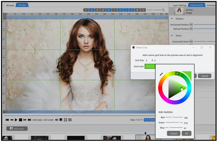
The grid color defaults to white, which may be difficult to see if you use a light-colored image. You can change the color of the grid by selecting either of the Define Grid options and then clicking on the color swatch to choose a different color.
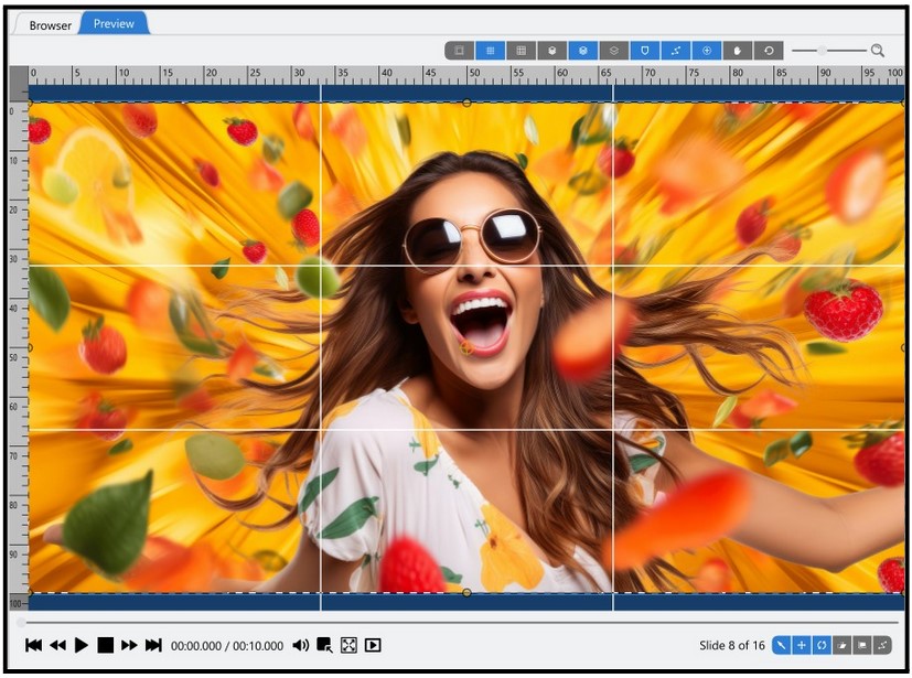
The Grid Size numbers are not the number of lines but the number of sections created by the lines. The default grid is 3 x 3, or three grid blocks horizontally and three grid blocks vertically.
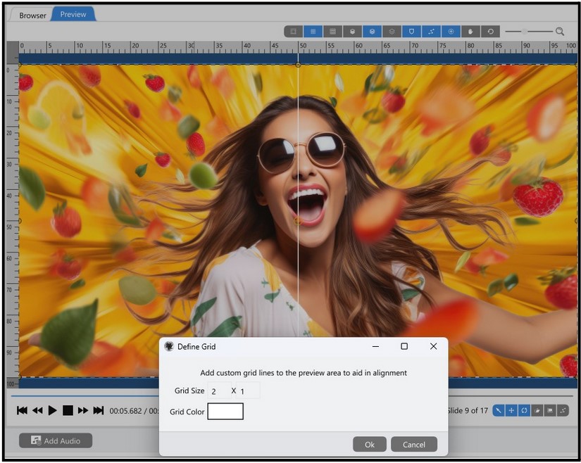
When the Grid Size is defined as 2 x 1, the result is a straight line down the middle, showing two horizontal sections and one vertical section (the entire screen counts as 1).

One of the most helpful grids is a simple 2 x 2, which divides the preview in half vertically and horizontally. This Grid displays four quadrants and defines the center point of the preview.
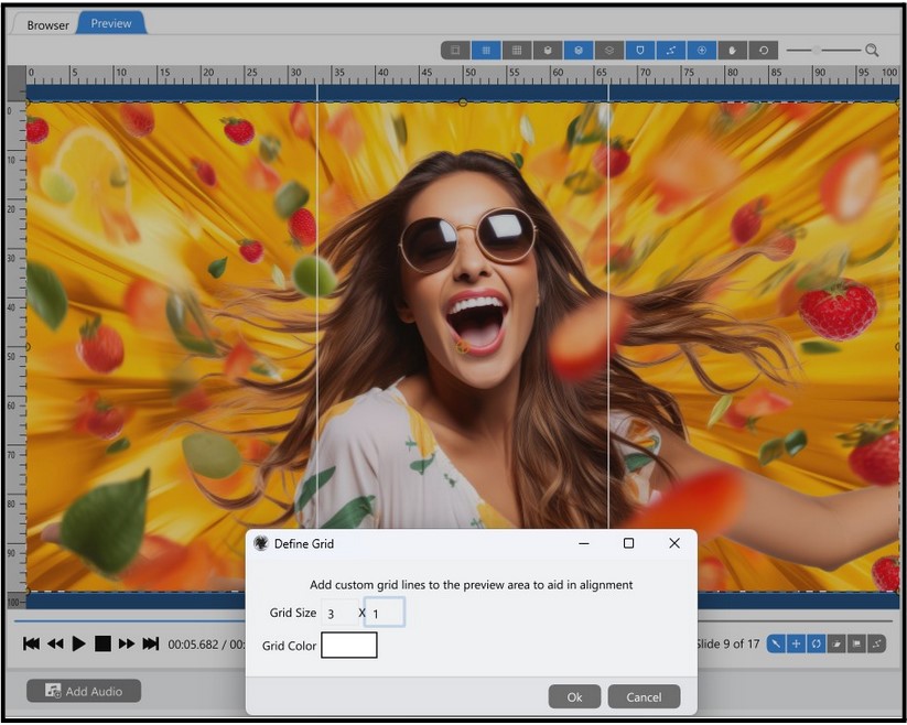
Another standard grid formation is 3 x 1, which breaks the canvas into equal thirds.
Although Photopia’s grids do not have a snap function, they can be helpful visual guides when creating slideshows.


